
On Demand Service - Dashboard Web App
Real-Time Supply and Demand Balancing for On-Demand Services

Role
Product Designer
As the product designer, I took the entire ownership and responsibility of this project to run it from initial discovery state to the final concept, Due to its technical complexity, I closely collaborated with the Principal Engineer to ensure the design was both user-centered and technically feasible, balancing user needs with technical constraints.

Background
On-demand home services rely on real-time Service Provider (SP) availability and quick decision-making by the operations team.
Existing Workflow Challenges
- The Operations team heavily depends on the Data team to generate and interpret supply-demand reports.
- Lack of self-serve tools limits agility and responsiveness in the field.
Core Problem
Service requests spike unevenly across time and regions.
Ops team lack visibility into live SP distribution and booking hotspots.
This leads to:
❌ Unmet customer demand
❌ Underutilized service providers
❌ Slower Ops team decisions
ATLAS Map Dashboard
The ATLAS Map Dashboard is a dynamic, location-based visualization tool designed to help operational teams effectively balance supply and demand. It combines real-time data on demand levels, service partner locations, and performance metrics to facilitate data-driven decision-making.
Project Challenges
This was a first-of-its-kind initiative in a niche market with few existing ‘playbooks’.
Challenge
- Lack of industry benchmarks meant we had to rely on internal research and field insights.
Our approach
- We co-defined the problem space with ops and built a custom tool based on direct pain points, Ops team needs, and real-world behavior.
High Level Approach
Turning Location Data into Actionable Insights through H3 Hexagonal Grid
Why Hexagons?
H3 hexagons allow cities to be analyzed consistently without relying on arbitrary shapes like zip codes or ‘hand-drawn zones’. They provide smoother radius estimations, single neighbor distance, and better performance for tracking movement across areas.
- Unlike square or arbitrary zones, hexagons offer uniform bordering and minimize spatial distortion.
- Enables better clustering, neighbor tracking, and supply-demand heatmaps.
- Proven by Uber: hex grids are optimal for dynamic dispatch, pricing, and high-frequency geo-events.

Multi-Level Grid View
Since H3 supports 16 levels of zoom granularity, allowing teams to zoom in for granular demand (e.g., within SCBD) or zoom out for city-wide monitoring.
Overlay-First UI Architecture
Geo events are visualized as overlays on hex cells. This helps operations teams instantly interpret where intervention is most needed.
Ops Team-Optimized Information Hierarchy
Supports filters by service type, time, availability status, and Service Providers Performance.
Design Solution
City Level View
- The ATLAS Map Dashboard starts with a city-level view divided into uniform hexagonal tiles, using Uber's hexagonal map data for consistent spatial analysis.
- Operational teams can filter by service type, date range, and city, and view demand levels and the number of service partners per hexagon.
- Filters allow users to focus on specific demand levels or highlight unallocated or uncompleted bookings, helping teams quickly identify demand hotspots and optimize service partner allocation.

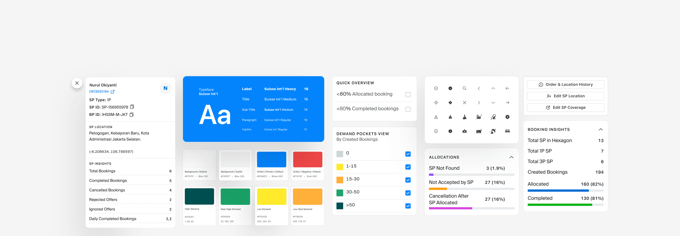
Edit Service Coverage
The Edit Service Coverage feature provides the operational team with a comprehensive view of service coverage at both city-level and detailed hexagon-level. This allows them to easily manage and adjust the areas covered by each service partner (SP).
- Add or Remove Coverage: Operational teams can quickly add or remove hexagons from a service partner’s coverage area. The process is straightforward, involving just a few clicks to select the relevant hexagons.
- Location Search: To streamline the process, a search function allows ops to quickly find specific locations, eliminating the need for manual zooming or scrolling. This enhances efficiency and ensures more precise edits without wasting time navigating the map.
This feature empowers the operational team to make real-time adjustments to coverage areas, ensuring optimal service distribution and quick responses to changing demand.

Map View
In this view, the dashboard will show the highlight on selected hexagon, booking and allocation insight and the SP performance on selected hexagon.
Each view allows the team to drill down into specific data points:

- SP Marker View
This shows the distribution of service partners (SP) within each hexagon, categorized by SP type (1st party or 3rd party). For services with gender preferences, like body massage or home cleaning, the SPs are further divided by gender (male or female) for a more granular view.

- Demand Pocket View
In this mode, the SP distribution on other hexagons is hidden, highlighting only the booking and allocation insights and SP performance for the selected hexagon. This view helps the operational team focus on demand patterns and performance in specific areas.

- Supply History View
This shows the historical sources of SP locations that took bookings within the selected hexagon, providing valuable insights into service partner coverage over time.

- Service Coverage View
This view displays the active service coverage for the selected service location, helping teams assess whether a specific area is adequately covered or if adjustments are needed.

Move Service Provider Location
The Moving SP Location feature allows the operational team to efficiently reallocate service partners (SPs) based on performance and demand. The process starts by using filters to identify SPs with the best overall performance across the map. Once an SP is selected, the team can view detailed performance highlights for that SP.
Relocating an SP is simple: the team clicks on the "Change SP Location" option and selects the new location. The map also displays SP distribution, highlighting areas with overcrowded SPs and areas with underserved demand, guiding the team to make informed decisions on where to move SPs for optimal coverage and performance.

Add and Remove Service Provider Coverage
The Add and Remove SP Location feature allows the operational team to easily adjust a service partner's (SP) coverage area, similar to the edit service function. This functionality is designed to help optimize SP allocation based on demand.
- Add Service Provider Coverage:
- The team can select specific hexagons to add to an SP's coverage area, expanding their service reach to new locations.

- Remove Service Provider Coverage: Similarly, the team can select hexagons to remove from an SP's coverage, streamlining their area of responsibility based on performance or demand.

This simple, intuitive process ensures that SPs are allocated to the right areas, maintaining efficient service coverage.
SP order and Location History
The SP Order and Location History feature provides operational teams with detailed insights into each service partner’s (SP) activity, including both order and location history.
- Order History: This section tracks the complete order lifecycle, showing the status of each order from offered, assigned, and ongoing to cancelled. This allows the team to monitor SP performance, track order fulfillment, and identify any potential issues or bottlenecks in the service process.
- Location History: The location history provides a log of each SP's movements, with precise details on the latitude and longitude of their position, as well as the time they were at each location. This helps the team track service partner coverage and movement patterns, ensuring they are optimally positioned to meet demand.
This feature enables a deeper understanding of SP performance, both in terms of orders and location management, providing operational teams with the data they need to make informed decisions.

Outcome
Although the impact analysis is still to be conducted following the launch of the improved product in early 2025, we anticipate several positive outcomes based on the features and improvements introduced:
- Improved Operational Efficiency with streamlined SP location adjustments and real-time demand insights, operational teams can make quicker decisions, reducing delays and optimizing service coverage.
- Better Resource Allocation visualizing SP distribution and demand hotspots helps allocate resources more effectively, leading to better coverage and fewer unallocated orders.
- Higher SP and Booking Optimization tracking SP performance and location history enables better placement and availability, improving booking conversion rates and reducing cancellations.
- Scalability for Future Growth the flexible dashboard supports operational scaling, allowing teams to manage larger areas efficiently as the business grows.
Overall, while formal impact analysis is pending, the early launch is expected to improve the speed, accuracy, and flexibility with which operational teams can balance supply and demand, ultimately driving better service delivery and operational outcomes.
Learning
Key takeaways include the value of iterative design and adapting to feedback, the importance of reducing friction in task execution, and balancing precision with clarity in data visualization. This project highlighted the necessity of continuously testing and refining designs to ensure they meet real-world user needs and enhance operational efficiency.